Developing Accessible Apps
Wayfindr
May 19, 2016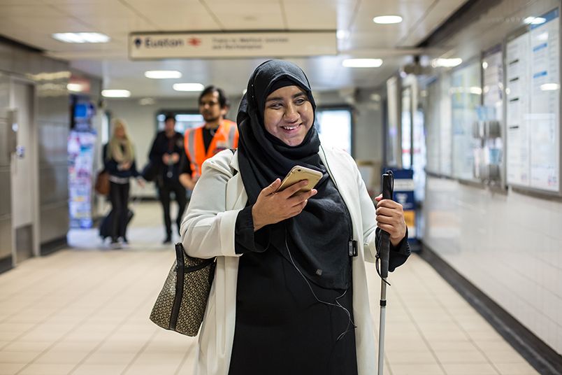
As part of Global Accessibility Awareness Day (#GAAD) we wanted to share some of the lessons learned from developing the Wayfindr Demo mobile app, testing it in real settings with users who have one or more disabilities. In our case, we were developing an iOS app to be primarily used on an iPhone by someone who is vision impaired. However, many of the ideas are equally applicable to other software platforms, hardware devices, venues, and users with varied disabilities.
VoiceOver
Apple has provided a way to read-aloud any text on the screen automatically since the early days of the iPhone. This tool is called VoiceOver. It allows a user to quickly swipe between elements of the screen and get a description of what is contained within the element and what interactions can take place. For many text-based elements, support for VoiceOver comes free to developers – no extra work is needed.
For non-text based elements or for elements where additional description may be needed for users with vision impairments, there are additional properties a developer can specify. Using accessibilityLabel we can provide the system with a short bit of text to be read aloud to describe the element. If this is not sufficiently unambiguous, the accessibilityHint can be used to provide additional context. The last major accessibility tool to make the user interface accessible using VoiceOver is the accessibilityTraits. These are pre-defined traits that describe the element and interactions that are available (e.g. Is it a button? Does it play a sound? etc.).
There are many other items defined in the UIAccessibility protocol, but those are the big three that can quickly make your app more accessible.
Dynamic Type
Starting with iOS 7, Apple introduced the idea of Dynamic Type. Rather than having the developer specify the font and its appropriate size for each element of the screen, Dynamic Type allows the system to do this. As a developer, simply request the appropriate font from the system by using theUIFont.preferredFontForTextStyle constructor and pass in the desired text style (Title1, Body, Caption1, etc.). This is very similar to how web developers specify fonts.
While this takes the sting out of making sure every font and size is correct, new problems arise by supporting Dynamic Type. Since the user can change the default size (and whether or not the text is bold) by using the Settings app on their phone, suddenly the text can become much larger than you originally designed the element to handle.
While supporting auto-layout does allow some elements to grow automatically, most do not when the text becomes too large to display. Even UILabel does not automatically expand to display all of the text. To do this, we often need to set the lineBreakMode to something other than truncating and set the numberOfLines either to zero (which allows it to have an infinite number of lines, which is often what we want) or a number other than one.
Similarly, tables do not grow their cell size to support the enlarged text. Nor do UITableViewCell’s by default support Dynamic Type. Instead we must modify the UITableViewCell’s labels appropriately. In addition, we must set an estimated row height for the cells at the table level and the row height to UITableViewAutomaticDimension to allow the cell itself to resize accordingly.
Buttons
I would like to draw particular attention to text-based buttons. While this has become the norm over the last few years and VoiceOver provides automatic support for these, there are some additional thoughts that need to be considered.
When a user navigates through an app, by default the title of the previous screen becomes the name of the back button to return to that screen. While VoiceOver reads this aloud and even states that this is a back button, we found that our users became very confused by this. We had much better success by replacing the default back button with one that actually says ‘Back’.
Graphics
While very few graphics were used in producing this prototype app, I wanted to add a few thoughts surrounding this topic.
Using the accessibilityLabel, we can help paint a picture in the user’s mind about what the graphic contains. For example, if you are displaying a profile picture on a screen, you could write “Image of [INSERT NAME HERE]” to provide some context for a user with vision impairments.
Audio
In developing Wayfindr, we found that even using VoiceOver was insufficient most of the time. We wanted realtime instructions to be provided to the user. VoiceOver generally requires the user to initiate some interaction before any screen elements are read aloud.
To combat this, we used AVFoundation’s text-to-speech capabilities extensively throughout the prototype app. AVSpeechSynthesizer provides an easy to use audio engine. After instantiating, simply create an AVSpeechUtterance with whatever text you would like read aloud and ask the synthesizer to speak.
In addition to reading aloud the instructions, we took a cue from NSHipster and highlighted the words as they were being spoken.
Aaron's Top Tips
- The biggest tip I have for developers creating accessible apps is to turn on and use the accessibility features yourself. Don’t just use them when testing your app, but use them throughout all of your apps. You will quickly understand some of the pains users with disabilities go through when trying to use a mobile device.
- Buried at the bottom of the Accessibility screen in the Settings app on iOS is an item called “Accessibility Shortcut”. I use this be able to quickly turn on and off VoiceOver with a triple-click of the home button.
Resources
General Resources
- The Wayfindr Open Standard: The first working draft of the Wayfindr Open Standard gives venue owners and digital navigation services the tools to implement high quality, consistent audio wayfinding solutions. It includes an open-source demo app that enables people who download it to use BLE beacons to understand and implement the open standard with real users, in real contexts, in real time.
- Games Reveal the Contrasting Colors of Accessibility: This is a great discussion about how important color is in video games (and many other apps), yet how frustrating this is to those who are colorblind or have some other vision impairment.
Apple Developers
- Accessibility for Developers: This is the homepage for developing accessible apps on all of Apple’s platforms.
- WWDC 2015: Apple Design Awards: In 2015, the app Workflow won an Apple design award specifically for its phenomenal accessibility support. The demonstration is worth many a re-watch.
- Mac Power Users 293: It Kinda Is Rocket Science: In this episode of Mac Power Users, David and Katie interview a PhD student who is vision impaired and how she uses the accessibility features on a daily basis.
- WWDC 2015: Introducing the New System Fonts: This WWDC video describes the care taken by Apple in designing the new system fonts (San Fransico) to improve readability.
- AppleVis A website containing news about accessible apps in the Apple ecosystem. This is a great resource for inspiration.
Android Developers
- Accessibility for Developers: This is the homepage for developing accessible app on Android.
Windows Developers
- Accessibility Developer Hub: This is the homepage for developing accessible apps on all of Microsoft’s platforms.
Find out more about the Open Standard here.
Wayfindr
Our team combines the digital product and user centred design expertise of ustwo, with the Royal London Society for Blind People’s 175 years of experience working with blind people.